Monday, May 26, 2014

fucktonofanatomyreferences: A wicked fuck-ton of anorexia... [feedly]


----
fucktonofanatomyreferences: A wicked fuck-ton of anorexia...
// Art and Reference point


fucktonofanatomyreferences:

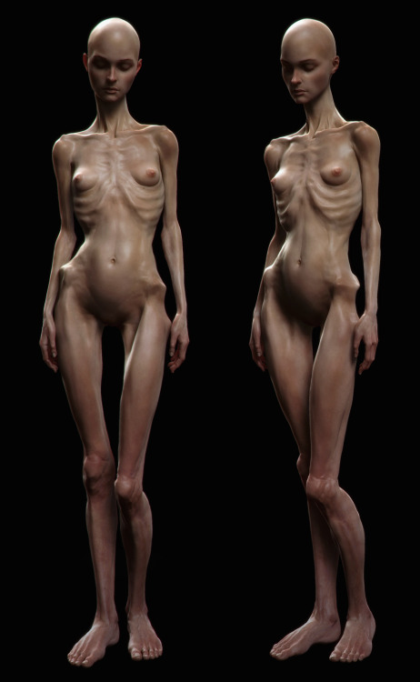
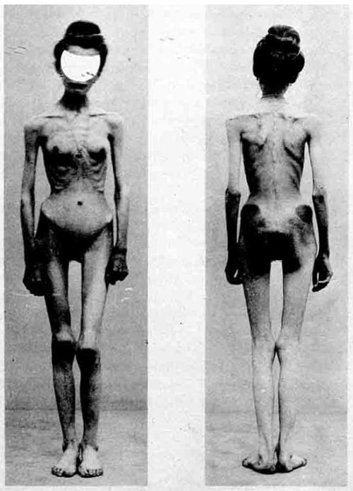
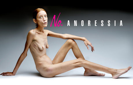
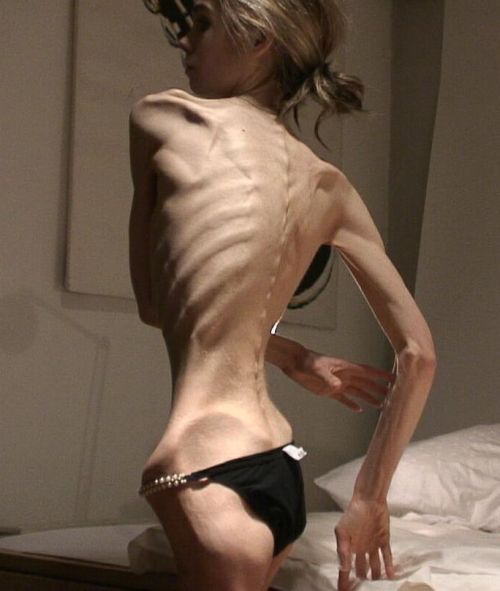
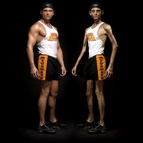
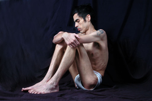
A wicked fuck-ton of anorexia references.

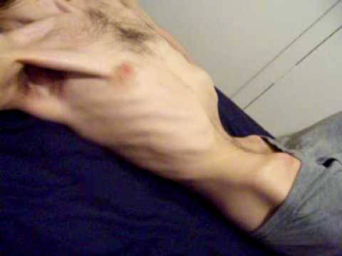
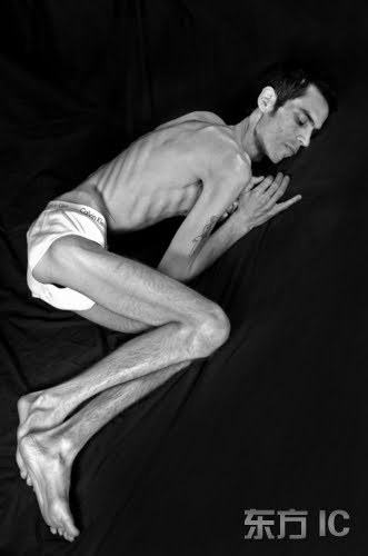
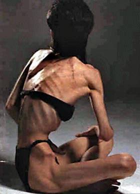
When drawing someone who's anorexic, people often tell you just to pull the skin over the bones, but that's not accurate. Granted, the skin'll be pulled tight and the bones'll project to an alarming extent, but there is still muscle underneath there (which'll, in fact, be even more noticeable now that the skin is tighter). It won't be giant, bulging muscle because of the malnutrition, but you ought to study the basic muscular anatomy of someone who doesn't work out. You need some muscle to move and keep your organs in place, so it will be seen through the skin. It'll be very vague, but still there. What you mainly see is the tendons and bone projection. Just don't forget about the muscle.

[From various sources]


----

Shared via my feedly reader


Sent from my iPad
Condyle (anatomy) - Wikipedia, the free encyclopedia

http://en.wikipedia.org/wiki/Condyle_(anatomy)


Sent from my iPad

kangarookevin: nayrosartrefs: Some awesome leg tutorials done... [feedly]


----
kangarookevin: nayrosartrefs: Some awesome leg tutorials done...
// Art and Reference point


kangarookevin:

nayrosartrefs:

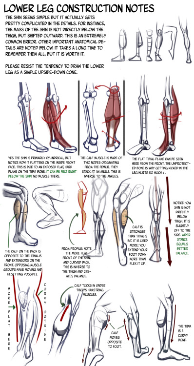
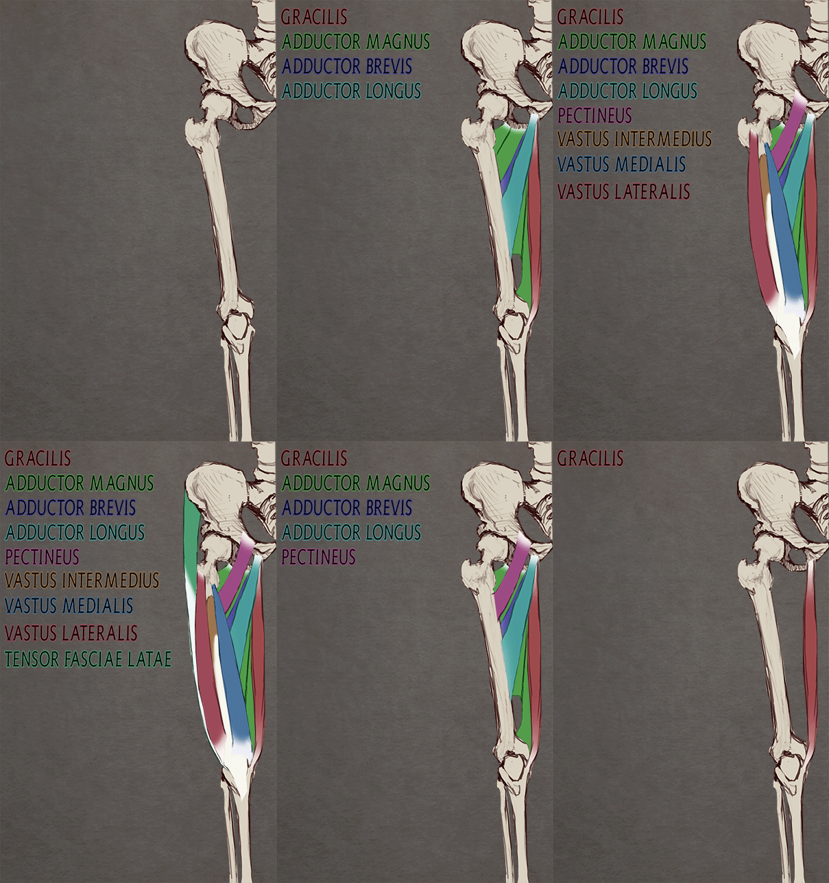
Some awesome leg tutorials done by n3m0s1s.

Because legs are the hardest thing to draw for me. Seriously, I'll have a character with an awesome upper torso, then spaghetti legs.


----

Shared via my feedly reader


Sent from my iPad
Thursday, May 22, 2014

Shared from Boing Boing

Tell Me Something I Don't Know 025: Stephanie Buscema - http://boingboing.net/2014/03/05/tell-me-something-i-dont-kno-11.html


Sent from my iPad

Wednesday, May 21, 2014

Tweet from Jorge González (@jorgeilustra)

Jorge González (@jorgeilustra)
Toulouse Lautrec pic.twitter.com/wc5pWC2PrA2PrA

Download the official Twitter app here


Sent from my iPad

Sunday, May 18, 2014

ref4u: How To Draw: Connecting the Legs and Torso by:... [feedly]


Sent from my iPad

bobbygio:        Boulanger - Herkules Omphale [feedly]


----
bobbygio:        Boulanger - Herkules Omphale
// Hyperwave


bobbygio:

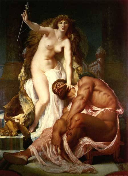
       Boulanger - Herkules Omphale


----

Shared via my feedly reader


Sent from my iPad
miyuli: Hand practice! My lecturer said my hands look all the... [feedly]


----
miyuli: Hand practice! My lecturer said my hands look all the...
// Art and Reference point


miyuli:

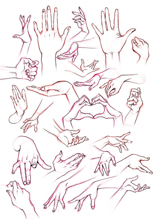
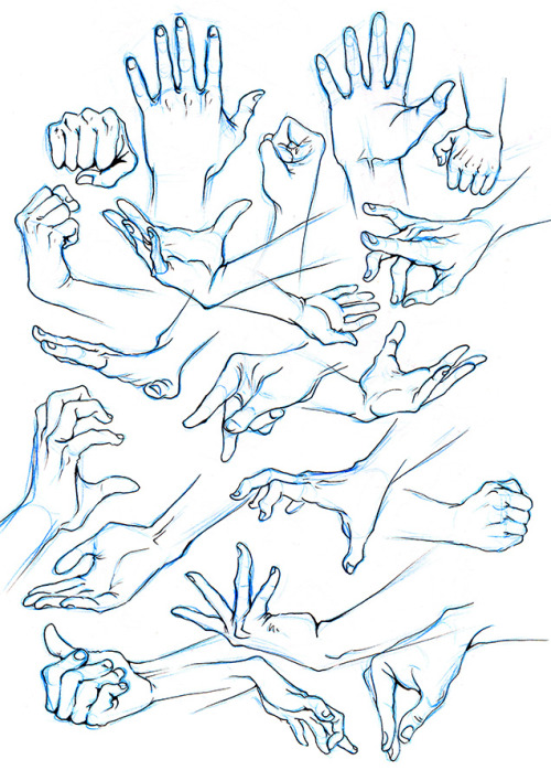
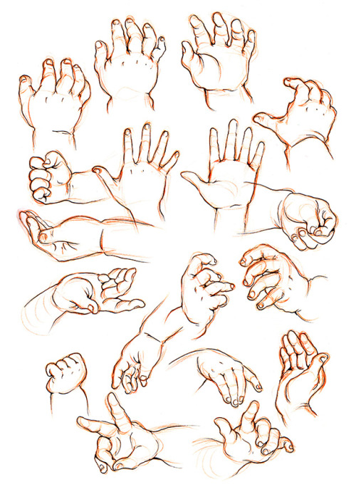
Hand practice! My lecturer said my hands look all the same so I tried to put in some character. It's hard! Will try to simplify more next.
(You're welcome to use these for reference)


----

Shared via my feedly reader


Sent from my iPad

Yvon's Academic Drawing Manual [feedly]


----
Yvon's Academic Drawing Manual
// Gurney Journey

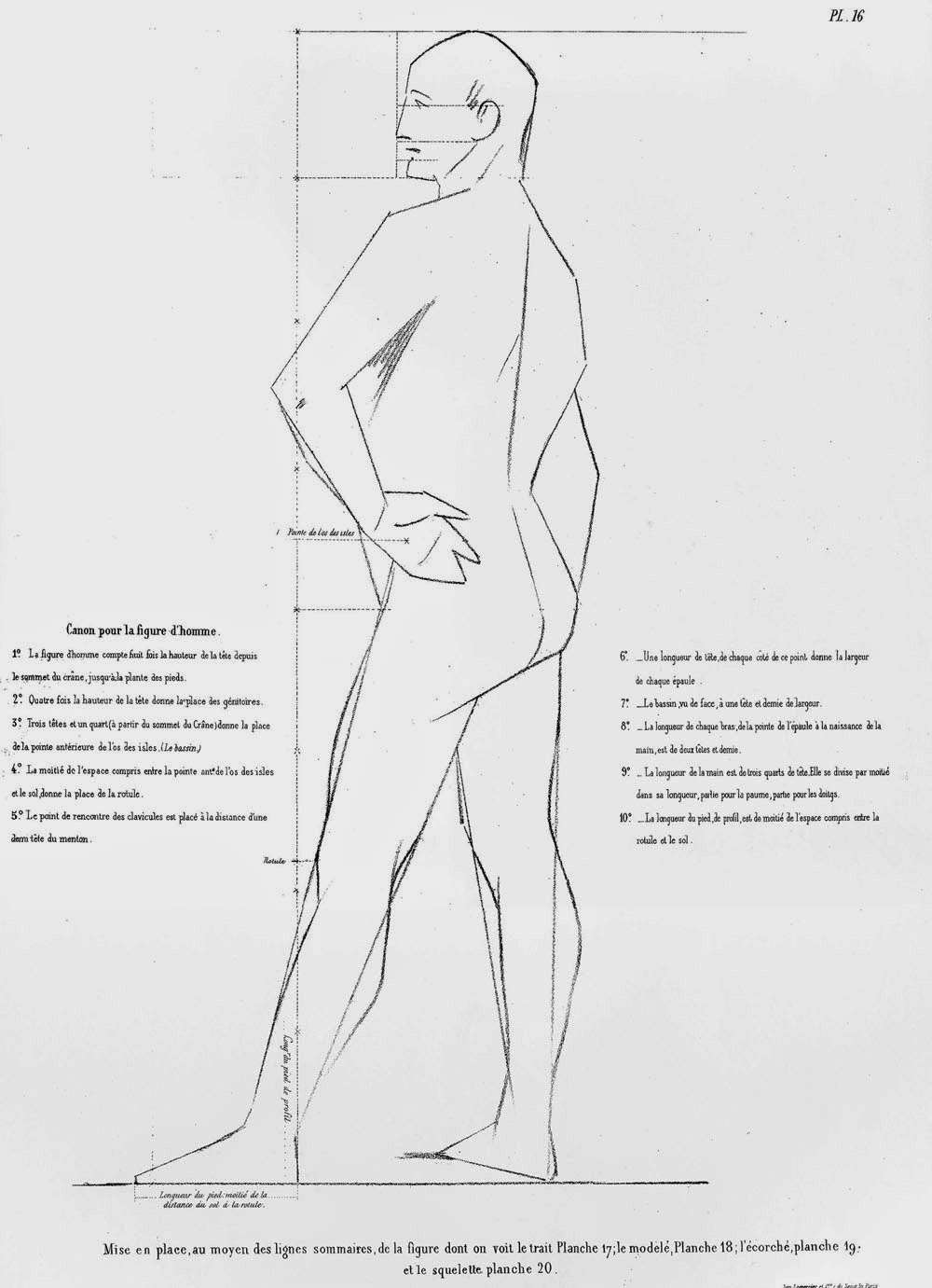
Many of you are familiar with the drawing course by Charles Bargue and Jean-Léon Gérôme. Painter and teacher Darren Rousar has procured another drawing manual from the period called "Methode de Dessin" by Adolphe Yvon.

This was the method used by John Singer Sargent when he studied in Paris. According to Rousar, copies of this manual are extremely rare, and he has generously offered to put his copy online for free, but first he's inviting French/English translators to help him render it into English.

Here's a preview of one of Yvon's plates. I'm just guessing from the plate, but it seems to be a slightly different process from Bargue. He still uses the straight lines, but rather than bounding the outside of the form in an envelope or polygonal shape, he seems to find the most general big line going through the contour. The vertical line appears to be a record of measurements and alignments, subdivided into smaller measurements, probably made with the plumb line.

Here's one of Bargue's plates for comparison, with the outside bounding envelope going from the forehead to the tip of the nose and the nose to the chin, with the plumb-line measurements marked on a line drawn inside the form.

Sargent said that the plumb line (basically a weight dangling at the end of a string) was essential:
"When drawing from the model, never be without the plumb line in the left hand. Everyone has a bias, either to the right hand or the left of the vertical. The use of the plumb line rectifies this error and develops a keen appreciation of the vertical."

If you'd like to participate in translating some of first pages (or just read them in French), here's a link to Darren Rousar's studio blog. 
----
Charles Bargue's method from Amazon
----

Shared via my feedly reader


Sent from my iPad
fucktonofanatomyreferencesreborn: A perhaps workable fuck-ton... [feedly]


----
fucktonofanatomyreferencesreborn: A perhaps workable fuck-ton...
// Art and Reference point


fucktonofanatomyreferencesreborn:

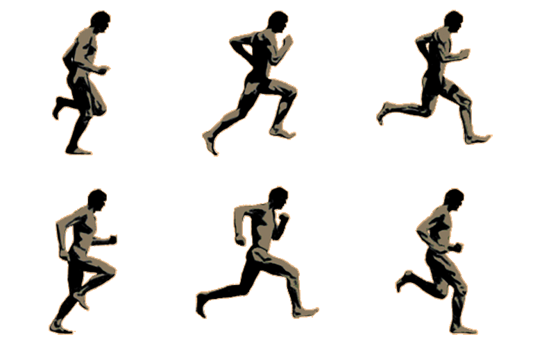
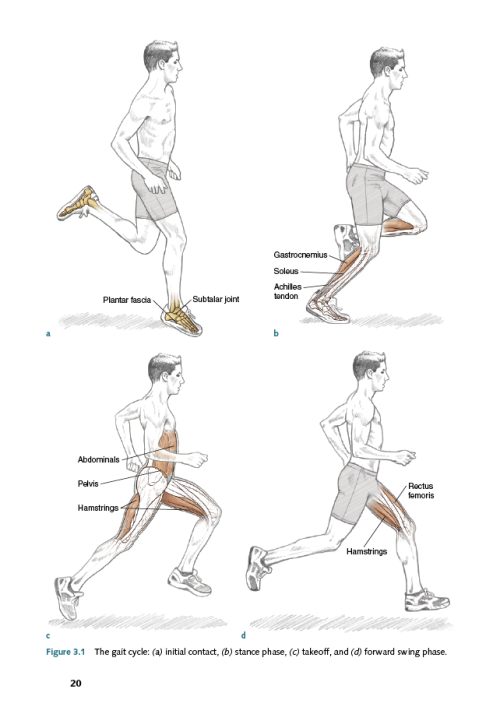
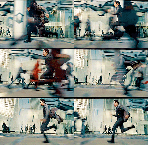
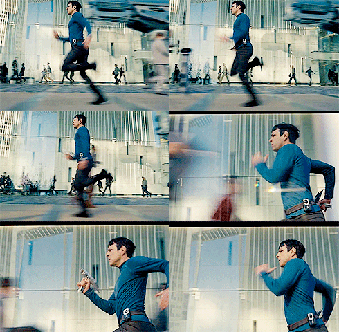
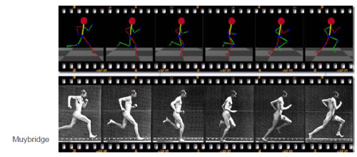
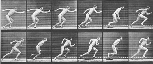
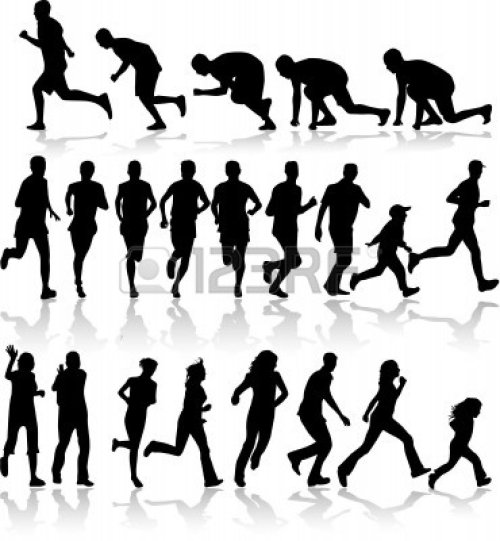
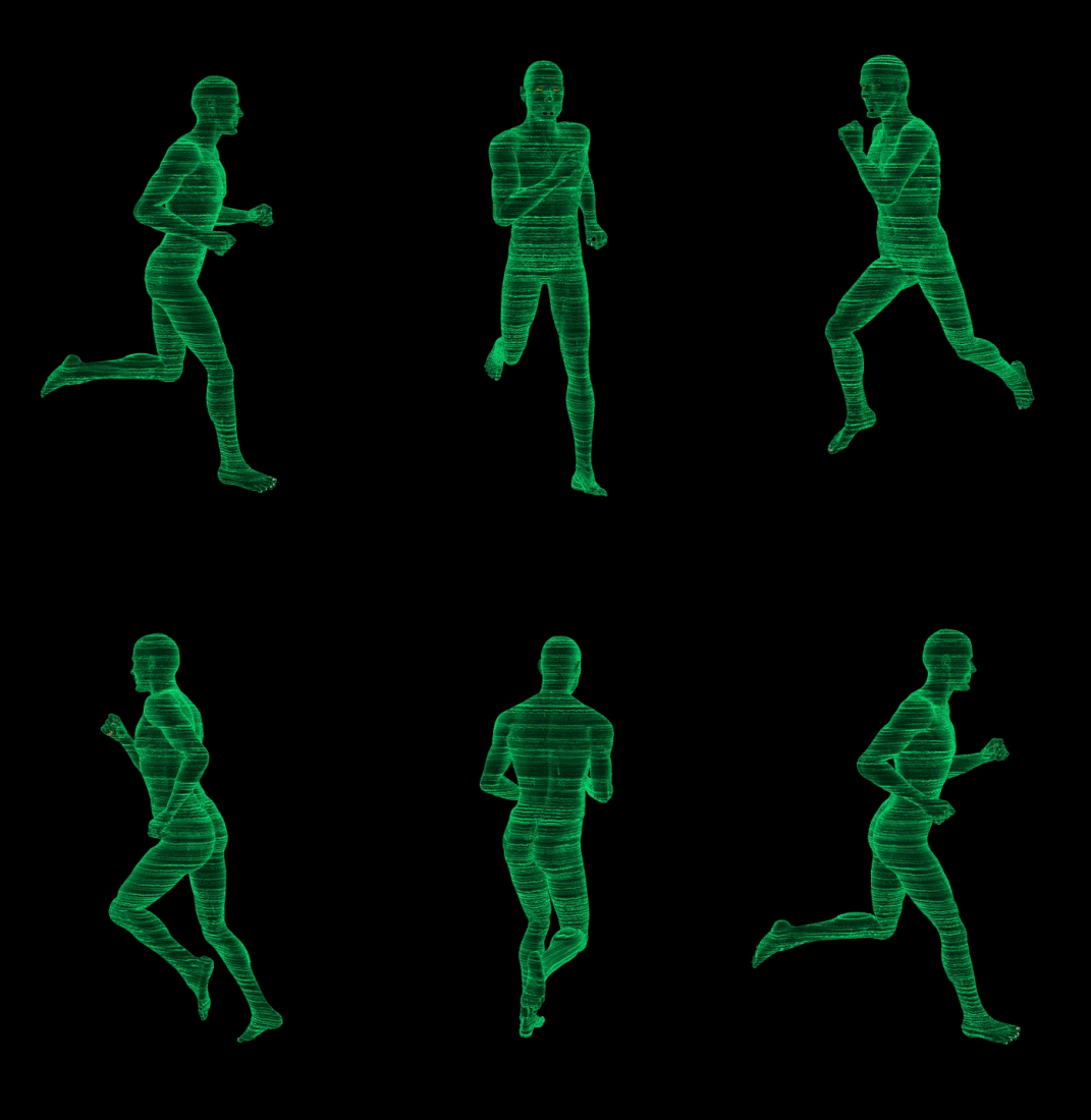
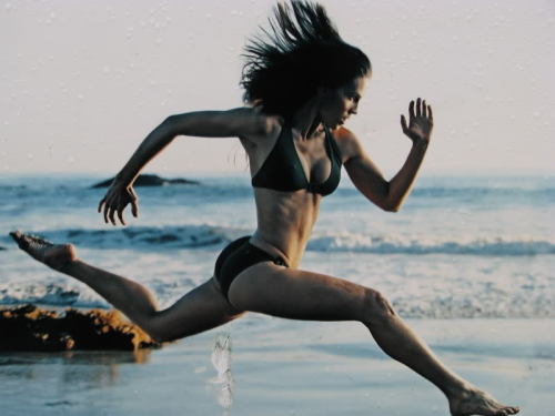
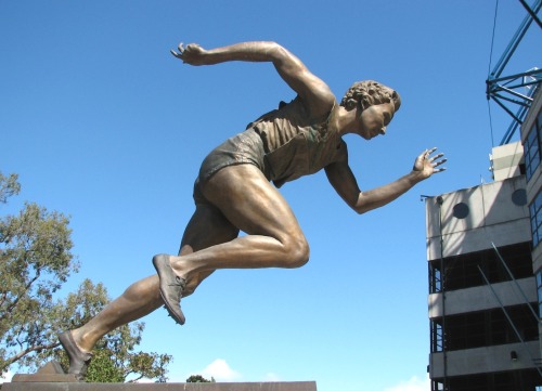
A perhaps workable fuck-ton of running references (per request).

[From various sources.]

(….. There is no rational reason for it to be this bloody difficult to find human running references…….) Just recognize that there are a few different kinds of running. The torso can be hunched over or upright. Understand the weight distributions and what happens if suddenly stopped. (I don't know as much about running as I ought to… I would suggest looking up "how to run" tutorials on YouTube.) O! And a common mistake is to make the front leg straight; DON'T DO THAT. The front leg, even when extending, is bent! The only time it's straight (like in the green GIF) is when the body is rising high enough off the ground to allow the leg to fully extend.

[And, allow me to clarify some of the comments that've shown up on this particular post: The first image IS accurate. The figure isn't moving up and down because it's going incredibly fast. The faster you go, the less you bob vertically. The Quinto/Cumberbatch GIFs are great examples of that. Also, yes, if you're going for practicality, the faster you run, the more of an angle you'll stoop to. But, mind you, the Star Trek GIFs are from a movie. It would not be fashionable to be hunched over. They're running aesthetically, not practically.]


----

Shared via my feedly reader


Sent from my iPad
Tuesday, May 6, 2014

Solomon's "Sacred and Profane Love" [feedly]


----
Solomon's "Sacred and Profane Love"
// Gurney Journey


The British painter Solomon J. Solomon (1860-1927) was eternally dissatisfied with his own work. He once destroyed a painting called "Sacred and Profane Love," even after it was accepted and exhibited at the Royal Academy.


The Magazine of Art had praised the painting as "executed in a masterly manner."

"The picture marks the advance of an ambitious and earnest young painter towards his goal....Towering on the summit of a rocky peak stands the Angel of Holiness, full of kindness and full of dignity, sheltering a woman and her child with one wing, while the husband sits below at their feet."

Fortunately, because the work was exhibited at the Royal Academy, there's an old reproduction of it.
------
Solomon's book on painting: The Practice of Oil Painting and Drawing


----

Shared via my feedly reader


Sent from my iPad
Pareidoloop [feedly]


----
Pareidoloop
// Gurney Journey

Can computers generate faces out of random shapes?


Yes. All you have to do is combine a random polygon generator with face recognition software.

The computer generates clusters of random polygons until a face detector notices something that looks like a face. Then the polygon cluster continues mutating in a series of generations as the face detector increases its confidence factor.

The software, developed by people like Phil McCarthy, Roger Alsing, and Greg Borenstein, resembles the human propensity for pareidolia, a form of apophenia where we see faces in clouds or tree bark.

Pareidoloop, programming by Phil McCarthy
An infinite number of faces emerge in this artificial evolutionary process.

You can watch the genetic programming happen in real time at a website called "Iobound Pareidoloop". Here's one I watched just now. It took 409 generations and about five minutes. If I had let the process go longer, it would have looked more like a face.
Sometimes the faces take on the appearance of wailing spirits struggling to escape from the void, like Michelangelo's unfinished slave statues. 

But they're nothing more than digital tea leaves, ink blots, random data.

Artists may feel a kinship for this process, as certain painters use a process of generating seemingly random shapes and then filtering out whatever doesn't add to the face-like appearance.

Roger Alsing has done an interesting variation on this idea. What if you set up the DNA for random polygon generation to match the Mona Lisa? Add to that the constraint is that you have to make the face out of no more than 50 semi-transparent polygons. Here's what the software gives us as it closes in on the finish:


Try out a demo of the software at "Iobound Pareidoloop".
More examples at Prosthetic Knowledge


----

Shared via my feedly reader


Sent from my iPad
The Joy of Drawing Dog Portraits [feedly]


----
The Joy of Drawing Dog Portraits
// Artist's Network

Learn How to Draw

ThomasDogFinalWe all admire those people for whom drawing seems to be effortless, sketching out portraits, figures, and landscapes rapidly and with confidence. The best thing about learning to draw is that it not only applies as a foundation for painting and other forms of art, but learning basic drawing techniques will allow you to see an immediate improvement and can assist you in learning to see the world in a new way. Another added benefit to learning to draw: you don't need a lot of expensive materials and supplies, or even a whole lot of time. Just grab some paper and pencils, charcoals, and a few other supplies that you can carry along with you to sketch anywhere, and take a few minutes every day to practice a value studies or sketches, and you'll start loving the results!

v9229

And why not start with those things around you? Joy discusses how working live is always best, if possible, but you can work from a photographic reference, as she does in this demonstration. But why not practice using a live model, and what better live model than your own favorite furry friends?

The Joy of Drawing Dogs
Joy Thomas is a great instructor, as so many of her students can attest. An award-winning artist, her portraits and commissions have been selected for many juried shows, including the historic Salmagundi Club and the National Arts Club of New York City. Her teaching methods have stood the test of time and experience, and you'll learn how to apply her classic drawing techniques, so reminiscent of the classic French artists and Old Masters, to your own portraits with relative ease. You'll learn tips and tools for getting composition and proportions correct and simplifying down into shapes for an approach that will show immediate improvement in your dog portraits.

ThomasDog

So often, we associate drawing animals with cartoons or illustration, but combining classic drawing techniques with animal portraits is an ideal way to capture the life and personality of your pet. Plus, with medical studies showing that pets are great for reducing anxiety, stress and other illnesses, and practicing art makes for great therapy, then drawing your dog is a recipe for good health, and dare I say it: Joy. So the next time you get the urge to take your dog (or someone else's) on a walk in the park, why not grab your sketchbook as well?

What Are You Waiting For?
Preview Classic Pet Portraits: How to Draw a Dog with Joy Thomas now to learn some of her favorite drawing techniques in charcoal. Then, head to ArtistsNetwork.com for the materials list, the full-length video, and to leave a review! Plus, see why Vicki says, "This is an amazing DVD."

Do you agree with the two 5-star reviews? Why not leave your own?

If streaming the video isn't your thing, you can also download it or purchase the DVD at Northlightshop.com.

Get even more art instruction from ArtistsNetwork.com with these FREE lessons!


----

Shared via my feedly reader


Sent from my iPad
Friday, May 2, 2014

Limited-Palette Portrait Demonstration With Nicholas Raynolds [feedly]


----
Limited-Palette Portrait Demonstration With Nicholas Raynolds
// Artist's Network

Limited-Palette Portrait
By Nicholas Raynolds

If you like this demo, check out the full feature article in our May issue, or subscribe to The Artist's Magazine for 10 full issues!

Attempting to complete a portrait while teaching a workshop isn't practical, so I created this step-by-step demonstration of Portrait of Morgan after the workshop, while working in the studio. I used a six-color palette plus black and white (see Raynolds's Studio Palette on page 60 in the magazine).

tam_may14_raynolds01

1. Drawing: I drew this piece in pencil over a couple of sessions. I always work from the general to the specific; from the flat/graphic shapes to dimensional forms. Accuracy of proportion and anatomical forms serves as the groundwork for the subtler, interesting problems associated with the sitter's character and expression.


tam_may14_raynolds02

2. Transfer: Before I transferred my drawing, I primed the surface with gesso, then with titanium white. After this, I toned the surface with a thin coat of chromatic gray. To transfer the drawing, I used charcoal on the back of a photocopy of the original drawing. Once the photocopy was positioned on the painting support with masking tape, I traced over the image with the objective of stating the most essential information. I was left with a faint charcoal outline, which I then drew over in India ink to secure the drawing to the canvas.


tam_may14_raynolds03

3. Underpainting: Once the drawing was established on the canvas, I blocked in the general color scheme of the entire picture. At this stage I worked relatively quickly, going from dark to light and using fairly thin paint—you could also call this an "underwash." My goal was to make a first statement in value, temperature/hue, and intensity while maintaining the integrity of the drawing. I tend to prioritize value and then temperature. Note, for example, the darks and lights and the cools and warms in the passage from the lower jaw, across the cheek, to the corner of the eye. When the underpainting was complete, I had the foundation upon which to begin painting the form.


tam_may14_raynolds04

4. Facial Form: Here you see that I had nearly finished the face. I'd worked at a thoughtful pace, rounding each form, establishing the relationship of one form to the next. I thought about the direction of the light, specific shape, location, and color (value, temperature/hue, and intensity) of each form. I allowed my brushstrokes to maintain their individuality while helping to unify the overall effect. I paid attention to edge quality, allowing for the variety of crisp and soft edges, as found in nature. I was open to making changes if I found them to be important; the shoulder, for example, seemed too large, so I carved it back. At this stage, too, I prioritize value and then temperature/hue. Again, note the transition from the underside of the zygomatic (cheek) bone to its high point, through to the corner of the orbit of the eye. Value and hue are readily expressed with a limited palette.


tam_may14_raynolds05

5. "Oiling Out": In returning to the piece from session to session, I sometimes found that the paint, in drying, had "sunk in" or lost the vibrancy it had when wet; this was especially true of the darkest darks. When this was the case, I "oiled out" the surface in order to bring the colors back to their original lustre. To do this, I used a little of my medium, brushed on thinly and only up to where I planned on continuing my work from the day before. I use caution when doing this because I risk reactivating the paint, causing colors to bleed and smear. Here I've completed the model's back, adding a dress strap for compositional effect, and thus finishing Portrait of Morgan (oil, 12×11).


Nicholas Raynolds studied art in Düsseldorf, Germany; Vancouver and Halifax, Canada; Seattle; and in New York City at the Water Street Atelier. He holds regular workshops around the country, including at the Art Students League of New York, the National Academy School of Fine Arts (New York City), and the Penland School of Crafts (Mitchell County, North Carolina). He has exhibited nationally at John Pence Gallery (San Francisco), Eleanor Ettinger Gallery (New York City) and Haynes Galleries (Nashville, Tennessee, and Thomaston, Maine), and his work can be found in collections around the world, Including the Forbes Galleries. For more information on Raynolds's artwork plus his class and workshop schedule, go to www.nicholasraynolds.com.


----

Shared via my feedly reader


Sent from my iPad
askthetitantrio: Since all my braincells seem to be devoted to... [feedly]


----
askthetitantrio: Since all my braincells seem to be devoted to...
// Art and Reference point


askthetitantrio:

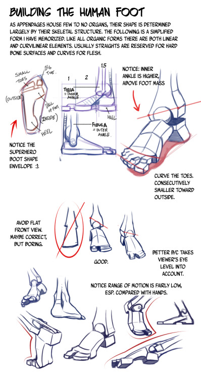
Since all my braincells seem to be devoted to school right now and none of the asks in my inbox are jumping out at me, I thought I'd answer this one with a quick tutorial.


----

Shared via my feedly reader


Sent from my iPad
14 years of Friedland [feedly]


----
14 years of Friedland
// Muddy Colors


In a previous post, I mentioned the painting Friedland by Ernest Meissonier and that it he painted it over an incredible 14 years.  These were not idle years either.  Much of the time was spent researching, repainting and restarting.  It involved real life cavalry charges, trampling crops, and laying railway tracks.  It also took place in one of the most pivotal decades of the 19th century, once which sprouted Impressionism, saw the Franco-Prussian war which laid the ground work for WWI, endured the Communards and witnessed the culmination of academic painting.  Fascinating times.


If you get the chance, read the book The Judgment of Paris: The Revolutionary Decade That Gave the World Impressionism by Ross King.  It is a very well written book, giving some great insights as to how some quite famous paintings came to be and as well as some important moments in history.

I came away with much respect and admiration for Meissonier and Monet, less for Manet and disdain for Courbet.  I was also struck by the lengths that the artists then would regularly go to to finish a painting.  It was also engrossing to read about the Salons and the weight they carried in the art world as well as the great expositions that drew people from as far away as China to Paris. There is far too much to share here in this post but I will share some details about one painting in particular, Friedland, much discussed in the book.

The painting hangs in the Metropolitan Museum of Art, and measures 53.5 x 95.5 inches.  It is not that large of a painting, not in relation to the time it took Meissonier to complete it.  He was a perfectionist to the highest degree.  He did massive amounts of research for a piece (he wanted to know what wheat in June would look like when trampled by a cavalry unit, so he planted a field of wheat, waited until the following June and hired cavalry to trample it).  He wanted to know how horses really looked when galloping, so he would gallop along the same cavalry taking notes.  When that was insufficient due to the difficulty of making and recording observations while at a full gallop, he had a small railway built on his property so he could sit in a special cart and be pulled along smoothly next to horses while they galloped.  The painting was repeatedly scraped down and parts repainted.  Portions that were once deemed finished and satisfactory were redone.  It was even punctured once by a falling mirror during a fencing match that tore a 3 inch hole in the middle.  This wound was dressed and the noble canvas continued it's long march towards completion.

It is a remarkable painting.  The horses alone show great character and individuality, much more than the charging riders, who all seem to be the same grey mustachioed character.  One of the most astonishing things to me about the piece is that much of the brushwork still seems lively and fresh.  I would have expected that after so many years of work, it would have been mind-numbingly overwrought.

I managed to take some good images of the painting.   They are very hi-res, so you might want to download them, or right click and open them in a new window or tab to see the details.


Detail of the much labored cavalry men, cuirassiers saluting Napoleon as they pass.  


I LOVE this white horse in the foreground.  He looks like he is about to speak.  Note how all the riders look like the same model, but all the horses have way more individuality.  The look might have been part of the uniform, I don't know.


I love the detail in the horse tackle here.  Tiny wonders, like the twist in the yellow reigns.  The metalwork on the buckles is also perfect.  It was said of his paintings that they could be viewed with a magnifying glass and that the viewer would be rewarded for doing so.


The Ol' Corsican himself, looking dapper and in command.


I love these fellows, tons of character in their faces and poses.


Awesome.  The lacing around those brass buttons and the incredible amount of pomp.  I like to imagine that their skulls are huge and the shape of those furry hats.


This horse is wonderful.  The look of terror in its eyes is so believable.  I don't know if it is because of the oncoming charge of cavalry, or that it has held this pose for 14 years while being painted.  Look how that rider is pulling the reign in with his pinky.  Note how it pulls his other fingers in.  I think this kind of detail comes only from deep knowledge and direct observation.


Great details on the cannon and boot.


And the final epic painting in all it's glory.  I didn't take this final shot, but found it online.

I find myself coming back to look at the detail in this painting again and again after reading of the effort that went into it's crafting.

Whatever it takes.
----

Shared via my feedly reader


Sent from my iPad