http://www.quickposes.com/
Sent from my iPhone
Monday, December 14, 2015
Sunday, December 13, 2015
Bruce Gilden’s ruthlessly unforgiving portraits are mesmerising [feedly]
----
Bruce Gilden's ruthlessly unforgiving portraits are mesmerising
// It's Nice That

We've featured Bruce Gilden's stark portraits before and his latest book Face, features some of the most unforgiving and extreme images we've seen from the photographer. Taken from 2012 to 2014 during Bruce's travels in America, United Kingdom and Colombia, each face fills the image in unabashed, unflinching defiance.
----
Shared via my feedly reader
Sent from my iPad
Sunday, November 22, 2015
Tweet by Lost Drawings on Twitter

Sent from my iPhone
Wednesday, November 18, 2015
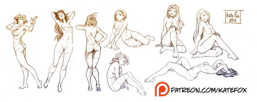
Pose study 20 by Kate-FoX [feedly]
Sent from my iPad
Wednesday, November 11, 2015
Tuesday, October 27, 2015
Wednesday, August 5, 2015
3 Life Drawing Tips from Rob Liberace [feedly]
----
3 Life Drawing Tips from Rob Liberace
// Artist's Network
I have to admit that I was too distracted by the masterfully rendered life drawings of Rob Liberace to at first pay attention to the medium that he uses to create figures with a reddish tint. The beautiful shapes and interesting poses of the models drew me in, taking me to a specific time and place: the Renaissance.
I was reading through the new eMagazine, Drawing With the Masters, which features life drawing techniques from Liberace, as well as Ted Seth Jacobs and Anthony Ryder. In the article by Austin R. Williams on Liberace, I learned about the artist's drawing materials: "Red chalk is one of the great approaches to drawing due to its natural beauty and a warm glow that suggests the heat of the human body," says Liberace. I couldn't agree more.

Twist (red chalk and colored pencil, 16×20) by Rob Liberace, www.robertliberace.com (Pin this!)
Williams adds, "Today the material is often called sanguine, a fact that highlights the link between the color of the medium and the redness of blood. Natural red chalk is hard to find in art stores, and it can produce very inconsistent lines. However, modern-day equivalents such as Conté or terra cotta pencils still have the warmth of natural red chalk with few of the drawbacks."
You'll learn quite a bit in Drawing With the Masters, which you can download for only $3.99. Here's a preview of drawing tips from Liberace.
3 Life Drawing Tips from Rob Liberace
1. Vary the direction of your strokes and the weight of your line to give a sense of space and atmosphere to your drawing. If your lines move only one way all around the figure, the image will look flat.
2. When shading an area, ease the pressure you're putting on your drawing instrument when moving toward the light. Then, draw with increasing pressure when your line is moving into an area that faces away from the light.
3. Use a brush to occasionally blend your strokes. This will give your drawing a mix of hard, soft, blended, and clear areas, which provides greater realism. ~R.L.
Yours in art,
Cherie
@CherieTweetsArt

**Subscribe to the Artists Network newsletter for inspiration, instruction, and ideas, and score a free download on Human Figure Drawing: A Two-Part Guide by Sadie J. Valeri.
The post 3 Life Drawing Tips from Rob Liberace appeared first on Artist's Network.
----
Shared via my feedly reader
Sent from my iPad
Michelangelo on Struggle and Creative Integrity [feedly]
----
Michelangelo on Struggle and Creative Integrity
// Brain Pickings
"I do not know which is better, the ill that helps or the good that harms."
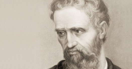
 Italian Renaissance sculptor, painter, poet, architect, and engineer Michelangelo (March 6, 1475–February 18, 1564) is celebrated as one of the greatest and most influential artists of all time. In 1505, thirty-year-old Michelangelo was commissioned to build a tomb for the newly elected Pope Julius II in Rome. It was an arduous process marred by constant interruption and interference by the pope, a bona fide micro-manager. Today, as scientists are finding that it takes our brains 23 minutes to recover from an interruption, Michelangelo's tenacity and his ability to carry out his creative vision despite the maddening meddling seems triply worthy of awe.
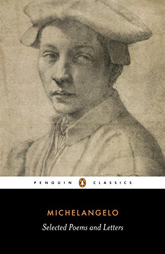
Indeed, he knew value of undisturbed creative labor and protected it fiercely, unafraid to stand up to the most powerful man in Europe. Unable to bear the interruptions any longer and determined to do his work on his own terms, he left Rome and returned to Florence, where he could work on his sketches and sculptures for the project in peace. In one of the missives collected in Poems and Letters: Selections, with the 1550 Vasari Life (public library) — an invaluable glimpse of the inner workings of Michelangelo's genius, from his daily struggles to his most elemental creative credos — he writes to the pope's head architect, defending his departure:
If I stayed in Rome, my own tomb would be made before the pope's. And this was why I left so suddenly.
Now you write to me on the pope's behalf, so you can read the pope this: let His Holiness understand that I am more willing than ever to carry on with the work; and if he wants the tomb come what may, he shouldn't be bothered about where I work on it, provided that, at the end of the five years we agreed on, it is set up in St Peter's, wherever he likes; and that it is something beautiful, as I have promised it will be: for I'm sure that if it's completed, there will be nothing like it in the world.
Michelangelo makes an impassioned, even indignant, case for what we now call remote work, half a millennium before cars and commuter rail and Skype:
Now if His Holiness wants to go on with it, he should place the deposit for me here in Florence and I'll write to tell him where. And I have many marbles on order in Carrara which I shall have brought here along with those I have in Rome. Even if it meant a serious loss to me, I shouldn't mind so long as I could do the work here; and I would forward the finished pieces one by one so that His Holiness would enjoy them just as much as if I were working in Rome — or even more, because he would just see the finished pieces without having any other bother. For the money and for the work I shall pledge myself as His Holiness desires and give him whatever security he requires here in Florence. Whatever it is, I'll give him that security before all Florence. Enough.
Although the project was scheduled to last five years, Michelangelo labored at it for four decades and never completed the tomb to his satisfaction — no doubt in large part due to the pope's unrelenting meddling. But as is often the case in creative culture, a small side project assigned to him shortly after the original tomb commission ended up becoming Michelangelo's most timeless legacy and one of the greatest works of art ever created: the ceiling of the Sistine Chapel, on which he worked almost incessantly between 1508 and 1512. And as is also often the case in art, Michelangelo's compensation was a pittance compared to the magnitude of his enduring gift to humanity.
In a letter to his father penned in September of 1512, as the Sistine Chapel project was drawing to a close, he writes:
I must warn you that I don't have a penny and that I'm barefoot and naked, so to speak, and I can't get the balance owed to me until I've finished the work; and I suffer the worst of hardships and toil. So, when you have to put up with some hardship yourself, don't be distressed, and as long as you can help yourself with your own money.
A month later, he sends his father a most understated, matter-of-fact, even wistful report on what is substantially one of the greatest masterpieces in the history of art:
I have finished the chapel I was painting: the pope is very happy with it, but other things haven't turned out as well as I hoped. I blame the times, which are so unfavorable to our art… I don't have what I need in order to do what I want to do.
Later that month, he writes to his father again:
I live in penury and think nothing of life or honors, that is of the world; and I live with immense toil and a thousand cares. And I have been like this for about fifteen years, without an hour of joy… I'm ready to do the same again for as long as I live or as long as I can.
It should be noted that Michelangelo tended to dramatize his poverty — he was actually made quite a lot by the era's standards. The Pope agreed to pay him 3,000 ducats for the ceiling of the Sistine Chapel. Even though Michelangelo was to buy his own materials, which cost about 1,000 ducats, the remaining 2,000 was a substantial amount — historians equate it to about $52,000 in today's money. (For a comparative reference point, his contemporary Leonardo — who died with 600 ducats in the bank — kept a careful log of expenditures in his notebooks and often listed the prices of common commodities: 11 ducats for a haircut, 13 for a shirt, 20 for a pair of glasses, 1 for a salad.)
Still, in the relative context of his cultural contribution, Michelangelo was practically robbed — consider, for instance, the exorbitantly greater sums contemporary architects are paid to build, say, a World Cup stadium where a very different form of modern worship takes place.
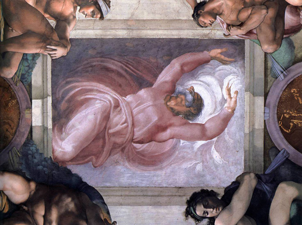
Separation of Light from Darkness: Michelangelo's fresco of The First Day of Creation, located above the altar of the Sistine Chapel
In a supreme twist of irony, Pope Julius II died just a few months later and was succeeded by a pope from the Medici family, history's greatest patrons of the arts — and yet Michelangelo's most enduring and beautiful work was done under financial strain and creative limitation. One is reminded of Kierkegaard, who observed that "the more a person limits himself, the more resourceful he becomes." Indeed, despite his complaints, Michelangelo was unperturbed by practical constraints and was carried forward by the truth of his creative vision, an "agent of transcendent power." He captured this universal credo of creative geniuses with simple sincerity in another letter:
What counts is that I shall do what I promised, come what may, and with God's help, I shall create the finest work ever made in Italy.
To be able to do that, Michelangelo continued to defend his creative autonomy. In 1524, while still working on the tomb, he wrote directly to the Medici pope Clement VII. However piously and humbly worded, his letter is essentially a telling-off, insisting on freedom from interference and interruption in his creative process:
Since intermediaries often cause serious misunderstandings, I make bold to write directly to Your Holiness about the tombs here in San Lorenzo. I must say I do not know which is better, the ill that helps or the good that harms. Witless and unworthy I may be, but I am certain that if I had been allowed to carry on as I started, all the marbles for these works would be in Florence today, blocked out as I need them and costing much less than they have so far; and they would be of admirable quality like the others I brought here.
Now I see that it is set to be a long business and I do not know how it will go on. If, therefore, something happens that displeases Your Holiness, I beg pardon, for I do not feel that I can be guilty where I have no authority. And if Your Holiness wants me to achieve something, I beg that you should not set other men over me in my own art, but have faith in me and give me a free hand; then Your Holiness will see what I can do and what account of myself I shall render.
That power of the artist's free hand, and the resoluteness with which Michelangelo defended it all his life, remains his greatest legacy. Befittingly, he depicted God separating light from darkness with his hands on the ceiling of the Sistine Chapel — and what is the artist's role in human life if not to separate, with his free hand, light from darkness?
Michelangelo's Poems and Letters is a magnificent read in its totality. Complement it with the illustrated life of Leonardo, Picasso on not compromising in your art, Jane Austen on defending your creative vision against commercial pressures, and Calvin and Hobbes creator Bill Watterson on creative integrity.
Donating = Loving
Bringing you (ad-free) Brain Pickings takes hundreds of hours each month. If you find any joy and stimulation here, please consider becoming a Supporting Member with a recurring monthly donation of your choosing, between a cup of tea and a good dinner.
You can also become a one-time patron with a single donation in any amount.
 Brain Pickings has a free weekly newsletter. It comes out on Sundays and offers the week's best articles. Here's what to expect. Like? Sign up.
----
Shared via my feedly reader
Sent from my iPad
Wednesday, July 15, 2015
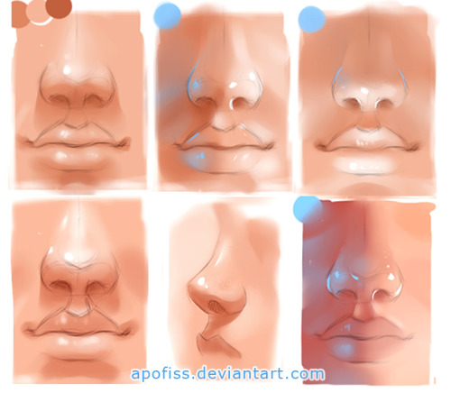
nosylips practise by Apofiss [feedly]
Sent from my iPad
Portrait Practice 9 Process by AaronGriffinArt [feedly]
----
Portrait Practice 9 Process by AaronGriffinArt
// How to Art
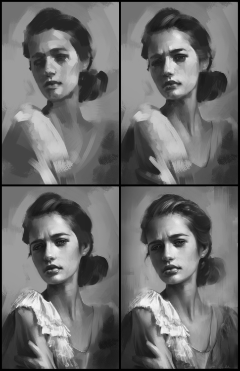
Portrait Practice 9 Process by AaronGriffinArt
----
Shared via my feedly reader
Sent from my iPad
Wednesday, July 8, 2015
Tweet by Evan on Twitter
| Evan (@CartoonBlock) | |
How To Draw Foot [step-by-step] referencesforartists.tumblr.com/archive pic.twitter.com/xgitwgYeKt | |
Download the Twitter app
Sent from my iPhone
Friday, July 3, 2015
Dorian Iten's Accuracy Guide [feedly]
----
Dorian Iten's Accuracy Guide
// Gurney Journey

Swiss artist and teacher Dorian Iten, who has studied in some of the best ateliers in the USA and Europe, is now offering a teaching package that concentrates on how to achieve accuracy in your drawings.

The teaching rubric of "Accuracy: A Drawing Guide" begins on familiar ground. He takes a line drawing of a figure on the left, and reproduces it on the right. The drawing on the right shows alignments along a vertical line.
Checking alignments is just one way evaluating a drawing for accuracy. There are four others, and he has concretized these modes of seeing by proposing five kinds of glasses. Each pair of glasses represents a different way of checking.

Clockwise from upper left, there are the Alignment glasses, Angle glasses, Measurement glasses, "Creaturizing" glasses, and Implied Line glasses. These are all methods used for 2D copying of static subjects; they don't really help you deal with moving subjects, and they're not about constructing forms in space.

Here's what you look for with the Implied line glasses on. The simplified contours seem to extend beyond the small forms and pick up again in other parts of the pose.

To Dorian, these glasses are more than just a metaphor. He actually has his students cut them out of cardboard (but you don't really have to). Here's Dorian wearing the angle glasses. Very stylish.

The entire teaching package includes two videos, a PDF guidebook, and a cheat sheet that thoroughly discuss this clever approach.
When deciding how to monetize the packet, he decided to offer it as a "$0+" pay-what-you-want product, registered under the Creative Commons license. I asked him why he decided to structure it that way. He said he did it that way because:
"• I'd like more people to be familiar with it - and use it
• I want to make the guide available to everyone, without a paywall
• PWYW removes the upper ceiling of fixed prices and allows happy/supportive contributors to give as much as they like
• It feels easier to promote than a fixed price product
• If there is a sacrifice of profit in order to reach more people (which there might not be), I'm willing to make it at this point in my journey"
One way to approach the transaction is to download the packet for free, try it out, and then decide what it's worth to you based on how much it has improved your drawing. Then you can go back and contribute based on whether, for you, it was worth the price of a cup of coffee, a magazine, or a day-long seminar.
----
Shared via my feedly reader
Sent from my iPad
Wednesday, June 24, 2015
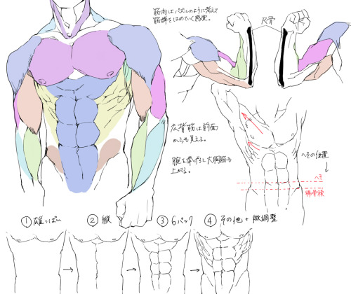
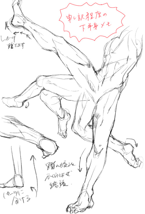
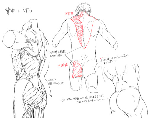
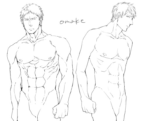
Anatomy Notes by モヴ@ツイッター [feedly]
Sent from my iPad
nvaderxim:SO THERE’S THIS THING CALLED ANATOMY360. The vimeo... [feedly]
----
nvaderxim:SO THERE'S THIS THING CALLED ANATOMY360. The vimeo...
// Art and Reference point
SO THERE'S THIS THING CALLED ANATOMY360.
The vimeo video page says:
Imagine having 1000s of life models on your desktop or your tablet, being able to change the lighting or viewing angle to anything you like, you will be able to change the angle whilst you sketch or sculpt turn the texture on and off to get a look at the underlying forms.
No more working from photographs or studying poor quality hand made 3D models This is 3D photography these are not sculptures or interpretations they are real people in real poses captured using 140 Canon DSLR's
----
Shared via my feedly reader
Sent from my iPad
supersonicart: Drawing Academy’s Free Drawing Video... [feedly]
----
supersonicart: Drawing Academy's Free Drawing Video...
// Art and Reference point
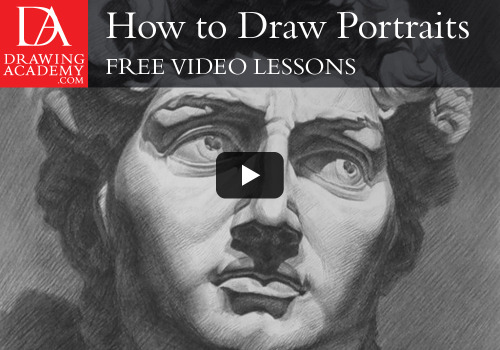
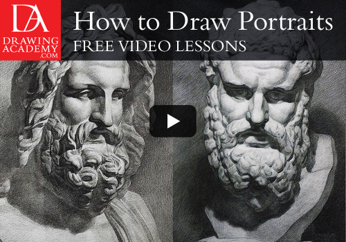
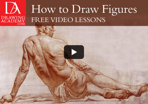
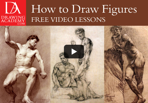
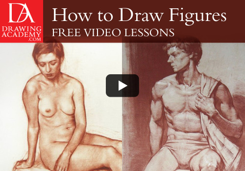
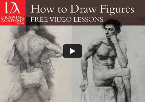
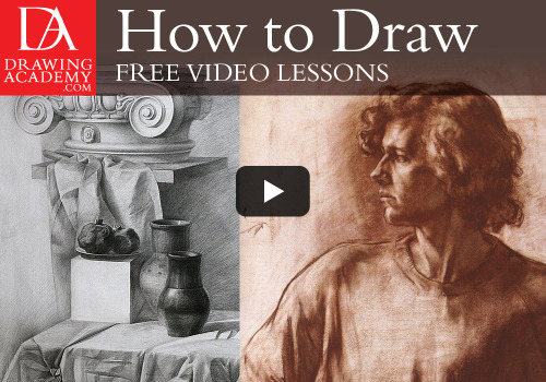
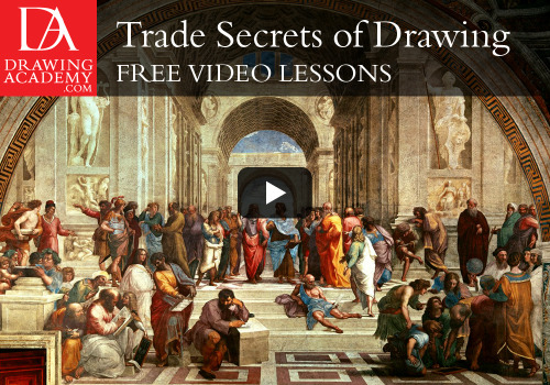
Drawing Academy's Free Drawing Video Lessons.
Sponsoring Supersonic this week is the online artist teaching resource Drawing Academy and they're offering several free, online video drawing classes for Supersonic readers (Plus more to come, stay tuned). The free classes also come with other valuable materials such as free eBooks, guides and art albums.
To sign up and receive your free art lessons simply head over to Drawing Academy.
----
Shared via my feedly reader
Sent from my iPad
Sunday, June 7, 2015


Striking pictures of London commuters in alternative newspaper Urbis [feedly]
----
Striking pictures of London commuters in alternative newspaper Urbis
// It's Nice That

Mark Sanders' latest photography project was inspired by L.S. Lowry's paintings of busy street scenes. Searching for a print format for his photographs of London commuters, he teamed up with former art director and designer of Mr Porter, Patrick Guilfoyle to present the project as a newspaper. Urbis is a nod to the free London papers, but rather than something to be left strewn on the tube, its beautiful images and quality paper stock make it feel like something to keep. Also unlike a typical newspaper, Urbis is virtually wordless so the photographs speak for themselves.
----
Shared via my feedly reader
Sent from my iPad
Monday, May 25, 2015
mylittledoxy: Check out the first part of this Hip/Femur... [feedly]
----
mylittledoxy: Check out the first part of this Hip/Femur...
// Art and Reference point
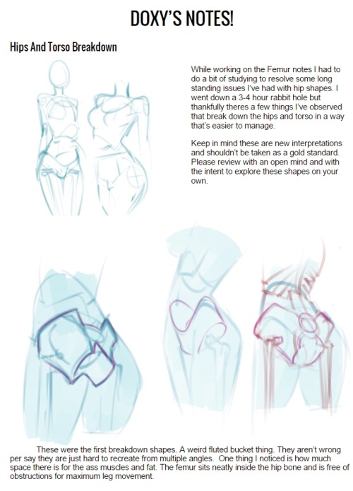
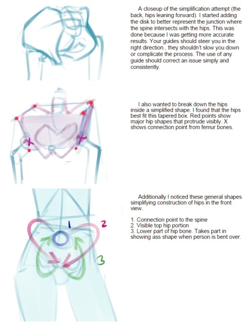
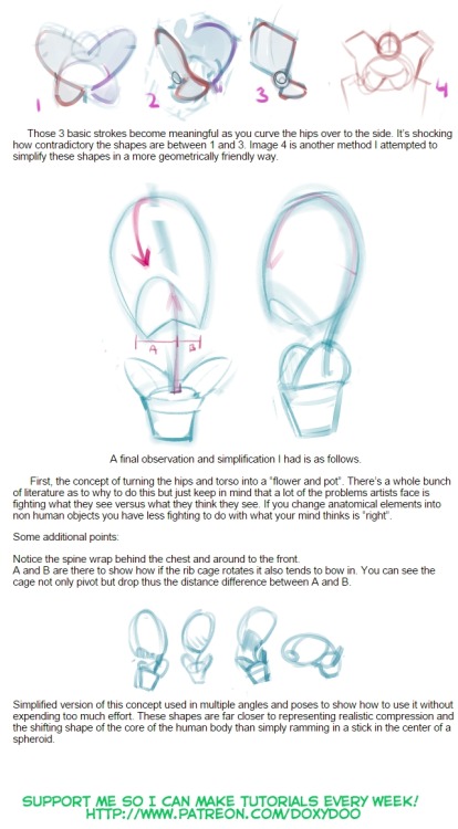
Check out the first part of this Hip/Femur Tutorial here!
Tutorial support here > https://www.patreon.com/doxydoo
----
Shared via my feedly reader
Sent from my iPad
Sunday, May 17, 2015
Yakovlev's Citroën Expeditions [feedly]
----
Yakovlev's Citroën Expeditions
// Gurney Journey
 |
| Alexander Yakovlev (1887-1938) Mirza Dolik |
 |
| Portrait of Mirza Dolik (detail) |

Alexander Yakovlev (also spelled Alexandre Iacovleff or Jacovleff) did the drawing as the official sketch artist of a motorized expedition across Asia.

The vehicle was a Citroën with a half-track in back. It drove across regions of the Asian continent that had no roads and very little petrol. Along the way the motor caravan overcame incredible obstacles, including warriors, mountain passes, and raging rivers.

Yakovlev was born and trained in Russia at the Imperial Academy of Arts under Kardovsky, and he lived later in France and America.
He was involved with two Citroën expeditions through Asia. The team traveled through Syria, Iran, Afghanistan, Mongolia and China. He also went on an expedition through Africa, crossing the Sahara to Equatorial Africa.

His portraits bear the intensity of the encounters between cultures unfamiliar with each other. In many regions, his lifelike portraits provoked awe, and the people seeing such drawings being made regarded him as a form of conjurer.
 |
Alexander Yakovlev Salek Ibn Mohamed sanguine and pastel on paper 29x21.5 in. |
Read More
Alexandre Jacovleff / Alexandre Yevgenievich Jacovleff on Wikipedia
Sothebys "Russian Pictures," June 2 at Sothebys London
Exhibition catalog with essay
Read a French website about portfolios of these portraits.
Tate Gallery has one of his works
Book: Great Adventures With National Geographic: Exploring Land, Sea, and Sky
Print articles:
"From the Mediteranean to the Yellow Sea by Motor," by Maynard Owen Williams, National Geographic, November 1932
"Through the Deserts and Jungles of Africa by Motor: Caterpillar Cars Make 15,000-Mile Trip from Algeria to Madagascar in Nine Months," by Georges-Marie Haardt, National Geographic, June 1926.
Related Posts on GJ:
Josep Tapiro's Ethnographic Portraits
Eugene Burnand's World War I Portraits
Related Posts on GJ:
Josep Tapiro's Ethnographic Portraits
Eugene Burnand's World War I Portraits
----
Shared via my feedly reader
Sent from my iPad
Sincerity [feedly]
----
Sincerity
// Temple of the Seven Golden Camels
When I was at CalArts many years ago, my teachers would use the words "sincere" and "sincerity" often. I know Frank Thomas and Ollie Johnston used these frequently words as well when speaking about animation. These words aren't used very often anymore (at least in my experience), and I've been thinking about them a lot lately. Maybe it's a good time to bring them up again.
The dictionary definition of "sincere" is free from pretense or deceit; proceeding from genuine feelings.
Some great advice on the importance of the subject from Ollie Johnston: "you have to make it sincere, so that the audience will believe everything they do, all their emotions. Ask yourself: 'what is the character thinking and why does he feel this way?'"
Sincerity is an elusive quality and hard to define, but very important to what we do. The films and characters that come from a real place and feel grounded and sincere will stand the test of time and be enjoyed by audiences for decades to come. Over the years there have always been snarky, insincere movies and they just don't touch audiences or live on in people's memories the way a really sincere story will. There's nothing wrong with those kind of movies, of course, but our goal in animation is usually to create stories that stand the test of time. And sincerity is key to accomplishing that goal.
I think the word sincerity has fallen out of fashion in the animation community, and I feel like when I use the word sometimes people roll their eyes. I think this is because, over the years, people have begun to associate the word sincere with things that aren't actually sincere at all, but are instead saccharine, cloying or overly earnest.
The definition of "saccharine" is excessively sweet or sentimental. The definition of "cloying" is to disgust or sicken someone with an excess of sweetness, richness, or sentiment.
I think that those of us in animation are wary of the word "sincere" because so many animated films over the years have tried to mimic the tone and feel of the best Disney movies and many of them have missed the mark. Many of these films have an overly sweet and sappy tone and feel completely insincere. Some people even have an impression that Disney films tend to be sappy or saccharine. I don't think they are (at least not the best ones). Over the years, Disney story people and animators have always tried to find the real, true feelings at the heart of every story and build our stories and characters on real emotions.
Also, the best Disney films don't shy away from the darker, more frightening parts of life. I think that's one mistake people can fall into that can cause a story to feel saccharine: they gloss over any actual conflict or potentially dark part of their story. That can make a film feel too overly earnest and create a feeling of insincerity. The best Disney movies find a way to deal with darkness and tragedy in a tasteful way that isn't overly heavy-handed or manipulative. That's another way for a film to become insincere: if the audience feels like you're exploiting something dark or tragic to force them to feel an emotion. Great film makers have a deft touch and can lead you into feeling what they want you to feel without you realizing what they've done. It's not easy, but it's key to what we do, and sincerity is very important to pulling it off.
So keep "sincerity" in mind as you work. There's no easy way to grasp what it means or implement it, but here are a few thoughts that might help you in that area:
No matter how fantastic or imaginative a world you're creating, your story and characters should always have a least a glimmer of basis in your experiences to ground everything. It's always best to base your stories and characters off of real people you know and real emotions that you've felt. If you're trying to express an emotion in your work that you don't understand or haven't felt, it just isn't going to feel real.
Don't ever base your work on what someone else has done. Copying someone else's work always falls flat and feels insincere. There have been a few distinctive animators over the years that have developed a unique style because it came out of their individual taste and personality. When someone else tries to imitate that style, it never feels sincere. Similarly, when a storyteller creates a story because they were inspired by another story, that always feels insincere and you can always tell. Dig deep into your own tastes and feelings to create something original. The world doesn't need clones of something that already worked once. The world always needs fresh ideas.
When you're being sincere, you will sometimes feel vulnerable. You might worry that people will laugh at you or mock you because you are putting real emotions on the page. I think that's why so many snarky and sarcastic stories are created: nobody ever mocks anyone for being sarcastic. People who are snarky and sarcastic are often revered for being cool and hip. It always seems more cool to not care about anything. But it'll never lead to a story that goes to a deep level or touches people.
As screenwriter John Milius once said, "It's easy to be cynical. It's hard to be corny."
----
Shared via my feedly reader
Sent from my iPad
I Made An Art Masterpost [feedly]
----
I Made An Art Masterpost
// Art and Reference point
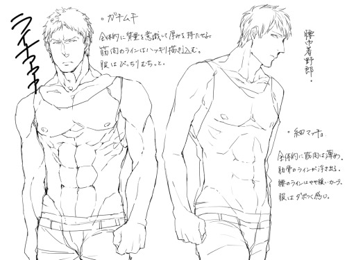
Bodies:
- how to draw arms
- *Hands*
- How To Draw Hands
- hands hands hands
- more hands
- another hand tutorial
- How to draw butts&thighs
- draw knees
- draw feet
- Kneeling + Sitting ref
- Body anatomy help
- The male torso
- Muscular male with bow stock photos
- Lots of Stuff
- All about the human body
- Pose studies
- 100+ anatomy references
- Sitting poses
- pose reference blo
- realistic woman body ref
- male body
- Pose Maker
- Poses
- hundreds of pose references wowie
- a guide to figure drawin
- torso reference
- How to draw penis
- Penis ref
- Kissing ref
Faces:
- Drawing expressions
- Creating expression
- Avoiding same face
- How to draw faces
- *Heads
- Heads&Angles
- contouring and highlightin
- drawing eyes
- *How To Draw Noses
- drawing ears
- how to draw profiles
- *How To Draw Lip
- lips ref
Hair:
Clothes:
- Drawing clothe folding
- How to draw folds
- Folding ref
- how to draw jeans
- hat ref
- *How To Draw Fabric Folds/Creases
- how to draw shoes/feet
Other (Person Related):
- Flower crown tutorial
- Drawing horse/animal legs on humans
- Anatomy of mutant humans
- Mass art ref
- Drawing human wings
- draw wings
- *How To Draw Cuts And Bruises
Other (non-specific):
- How to draw ice
- Drawing clouds
- Creature design
- Tutorial masterpost (100+)
- How to colour
- Drawing ref masterpost (10+)
- paint blood
- shadow help
- draw grass
I made this most for my own benefit to organize this stuff, and have no idea how to make a masterpost!Art ref
----
Shared via my feedly reader
Sent from my iPad
Eye Candy for Today: Adolph Menzel graphite drawing [feedly]
----
Eye Candy for Today: Adolph Menzel graphite drawing
// lines and colors

Carl John Arnold, Adolph Menzel
In the Morgan Library and Museum, use Zoom tab or download link.
Menzel gives us a superbly adept rendering in pencil. The drawing feels at once finished and casual.
Either the subject had a large head, or Menzel — after focusing on the portrait — compressed the figure somewhat to fit it on the paper.
Beautiful, nonetheless.
----
Shared via my feedly reader
Sent from my iPad
Thursday, May 14, 2015
Soft Lines and No Tension [feedly]
----
Soft Lines and No Tension
// Artist Daily
I'm not a napping kind of person. When I'm up, I'm up and I want to be doing something or on the go. That's usually the kind of body drawing that I'm pulled to as well--muscles torqued, body indicating action, and an underlying sense of movement. That being said, I do recognize and advocate for drawings that show the body at rest.
 |
| Doppelganger by Michael Grimaldi, 14 x 18, pencil drawing, 2005. |
There's something beautiful and quietly sensual about the human form lying prone or supine--a landscape of soft lines and no tension in the body. But in order to truly represent this kind of lassitude and ease when drawing human body sketches or studies, I need to be better equipped when it comes to figure drawing.
 | ||
| Nude Study by Edward Minoff, 16 x 12, charcoal drawing, 1999. |
I realize now that the body at rest is just as complicated as the body in action. Understanding how to draw a human body in both ways does an artist a good turn because you witness and take note of the body's muscles and bones in its widest spectrum of motion. That is always a good thing so that no matter what a model does or how they are positioned, I can "unpack" the form through anatomy so to speak.
If you want to really sink into knowing how to draw the anatomy of the body in all of its softness and sensuality as well as its power and movement, consider the Figure Drawing Master Class Mini-Kit. We at Artist Daily can't recommend it highly enough. You'll find a guide to drawing human forms from head to toe from favorite instructor Dan Gheno, showing the body in various stages of activity and position. Plus a year's subscription to Drawing magazine, where anatomy drawing is approached from an artist's perspective--giving you knowledge of the visual landmarks on the body and a sense of proportions that you'll want whenever you draw the figure. Enjoy!

----
Shared via my feedly reader
Sent from my iPad
Subscribe to:
Posts (Atom)