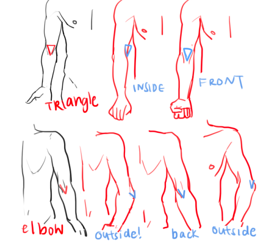
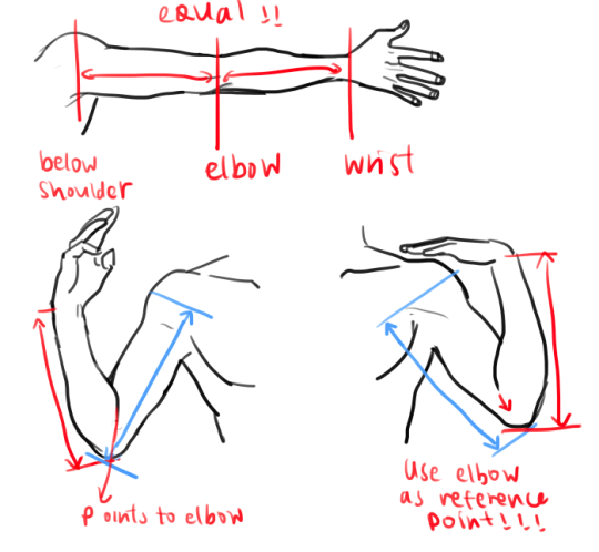
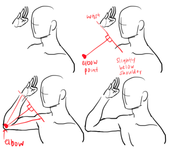
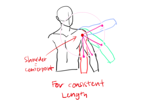
Tuesday, June 27, 2017

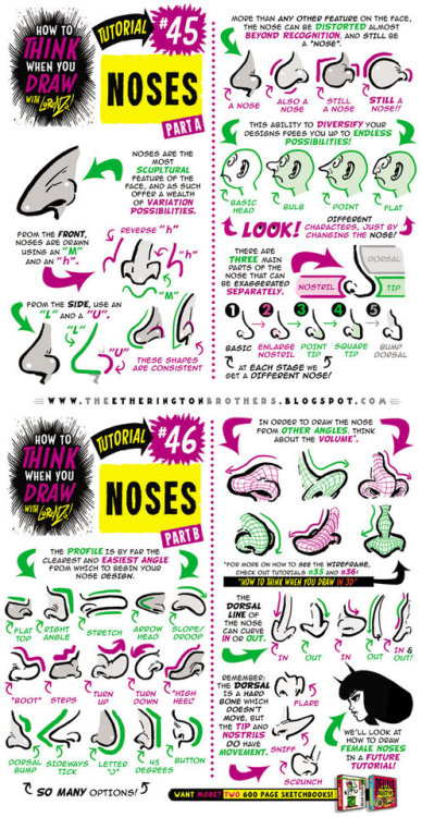
How to draw NOSES tutorial by STUDIOBLINKTWICE


Sent from my iPhone

Face of 500-Year-Old Dublin Man Reconstructed


----
Face of 500-Year-Old Dublin Man Reconstructed
// Archaeological Headlines - Archaeology Magazine

DUBLIN, IRELAND—Archaeologists have used the remarkably well-preserved skull of a young Dubliner, who died during the Tudor period (1485-1603), to reconstruct the man's face using 3-D digital technology. The Irish Times reports that the man's skeleton, which was found in 2014 during construction to extend Dublin's light rail system, indicates that he was in his late 20s or early 30s at the time of death and likely spent his whole life in Dublin under conditions of poverty and hard labor. According to Rónán Swan, an architect with Transportation Infrastructure Ireland, the remains of approximately 5,000 individuals have turned up during road and rail excavations in Ireland, but few have been intact enough to allow for reconstruction. To read more about facial reconstruction, go to "Neolithic FaceTime." 
----

Read in my feedly


Sent from my iPhone

Friday, June 23, 2017

Deciphering Flesh Tones


----
Deciphering Flesh Tones
// Muddy Colors

-By Howard Lyon


Color is a fascinating and challenging part of painting.  It can be defined as hue, saturation and value. Today, I am going to focus a little more on saturation. Saturation being how intense or gray a color is.

Before I get going though, I think I need to add a disclaimer to this post. Painting from life is the best way to understand color. Also, photographs of paintings are by no means the same or close to observing a painting in person and only capture a small range of color and value discernible to the eye.


With that out of the way, I do think there are some important things we can learn about color using the computer and photography. Also, photographing paintings for later study can help to reinforce or add to observations made in person. I mention this along with the disclaimer because I am going to use a photograph of a Bouguereau painting to make some observations today.


I have long been fascinated by William Bouguereau's paintings. There are other artists whose work I admire more for their artistry and subject, but I am hard pressed to think of another artist who achieved such a high level of technical skill. He could draw with great accuracy and had a wonderful eye for value and beauty, but for me it was ability to paint skin with very subtle shifts in hue and saturation that draws me in.

When Bouguereau was at his best, the flesh in his paintings looks like there is blood flowing just under the skin, vibrant and alive. You also see so much color. There is no 'flesh color' but many slight changes in hue and saturation that work together to create the impression of flesh.


In an effort to understand color a little better, I came up with a way of examining a photo of one of his paintings. I did this a few years ago and posted it on my site, but I did a little variant this time and I think it is more useful. Again, it is full of limitations, but maybe it will further cement knowledge you have or generate some new thoughts.


What the heck is going on here!? Let me explain. I am sampling colors from the face and hair. Each number and circle on the right show where I sampled a color. On the left, in column 'C' I filled the square with the sampled color and corresponding number. Column 'B' shows each of the colors, but with all of their values more or less equalized to a middle value. Column 'A' shows the colors with their saturation levels maxed out.

For me, column 'A' is the most revealing. When the colors are all shown at full saturation, the narrow range of hues used is much more obvious. Look at row 8. That color is from the white of her eye! It is really a very gray yellow, but it isn't as clear until the color was pumped up to full saturation. It is also neat to see the progression from swatches 5 – 19, from the top of the forehead to the chin and up the neck and see the small shifts from orange to red and back to orange.


In the image above, I have arranged the same colors descending from red to yellow to show the spectrum of colors used in a clearer way. I kept the original numbers paired to the swatches. Again, we have the sampled color in column 'C', the colors almost equalized (there is a little variation) to a middle value in column 'B' and the full saturation in column 'A'. Now, column 'B' stands out to me. Look at the top three rows, where the reds are nearly the exact same hue, but vary in saturation. They appear more blue or purple, warmer and cooler mostly due to their different saturation levels (they aren't the exact same hue, but quite close). Look down the rest of column 'B'. See how the colors vibrate and pulse in and out based on their saturation? More so than the fully saturated column 'A'. The variety you can get by changing the saturation just a little is very exciting to me.


Color starts to do some interesting things as you drop out the saturation. You can achieve a sense of blue, green and purple by dropping the saturation of red, orange and yellow. It is as if grey starts to take on the properties of a compliment when placed next to a color of similar value. The gray gives your more saturated colors life that they don't posses on their own. By working the saturation, you can create the appearance of blue veins under the skin, the purple flesh some complexions have around the eyes and cheeks and the cooler tones around the mouth and jaw.


If you are curious about giving this a try, next time you are painting flesh work in a neutral gray of similar value to the color you are working with and see what happens. See if you can create the appearance of color beyond those you squeezed out of the tube. That isn't to say you should or shouldn't use a full range of colors to paint flesh, but it is a worthwhile approach and exercise to try it if you haven't.

Of course this won't make you paint like Bouguereau, but hopefully it will either remind you or help you see how wonderful gray can be in adding life to your work.

*The photographs in this post are from the Art Renewal site and the Truth in the Bright Light of Day blog.
----

Read in my feedly


Sent from my iPhone

Sunday, June 18, 2017

Drawing Feet


----
Drawing Feet
// Muddy Colors

-By Ron Lemen

I simplified this dialog to the drawings.  This started off as a rant against the HUGE problem with every one of my anatomy students these days, the problem with drawing feet.

Somewhere out there is some misinformation, or alternative truths that seem to be popular to the newbie art student, but need to go missing forever please.  I have created some pages of useful information that need to be put out there into the system.  But first, let's start off with some wonderful drawings from the Russian Academy.  Who can resist the amazing studies from that school.  So much character, so much charm.


Anyway, my diagrams are nothing in comparison to these beautiful drawings.  But diagrams are not meant to be beautiful drawings.  They are meant to help you learn and clarity is important.  So I do apologize if the drawings are not totally clear.  And if they are not, please help me by mentioning that in the comments.

These are more excerpts from my soon to be figure drawing book, but since that is taking as long as it is to complete I am putting these notes out there now.  I also realize I have a lot of them so I am only going to post so many.  If there is something that feels like it is lacking, the book will have taken care of that.


Here is what I am seeing quite a bit of lately, both the drawings and the bone structure.  I have no idea where this is coming from, but the land of drunk socks and bigfoot must be steered clear of during your training.  Go back to it if you must stylize your feet, but, these are not good quality representations of real feet.


There is also a trend of missing heels.  Someone has gone around and removed the heel from the foot design and replaced it with a "Weeble Wobble" style foot design.  I guess the world isn't already dangerous enough as it is, let alone giving us unstable feet.


There is also this interesting trend of giving everyone bow legged qualities.  Shin bones are straight with curved accents.  They are not curved.  Sorry.


A descent starting point for the foot is the door wedge.  It helps check the perspective of the leg and assures that the feet are grounded to whatever surface they might be attached to.  This wedge is the ideal shape for the 3 points of the foot, ankles, toes, and heel.


The foot is a shock absorber for the body, it makes sense that the ankles, and the leg are positioned over the arch of the foot to take that impact, from walking to running and jumping.  Thank the feet for that arch, that we need to put the leg over and not behind.


The ankle bones are the tibia and the fibula together, and combined they form a wrench like structure that holds the foot bones in place as the pivot point for the foot rotation.  The bones are side by side medially and laterally, not in front and behind.  And each leg mirrors each other, they are not the same orientation to each other.


Here in profile view the door wedge is broken down into two shapes to help support the design of the foot when the toes are bent.  The toe wedge is removed from the front of the bigger foot wedge and is rotated to its new orientation.  This now becomes the new position for the toe details.


Here are the simple door wedges converted to planar structures to help design in the change of surface from one bone set to the next, over muscles and the orientation of the toes and their segments.


And while talking toes, here are the planar stair steps both in primitive form as well as fleshed out a bit more with the big toe and the second toe.  In addition, because our toes are smooshed together in shoes a lot, and because our feet our well designed, the toes fit together nicely, but are over exploited into ugly distortions of the design because our shoes mold our feet to the constraints of their size and build.  But, our toes are all uniquely shaped to fit together and the diagram on the left shows how they fit together.


And here are the folds in the bottom of the foot common with all of us but not the same length and exact orientation between any of us.  Note that the big toe actually has 3 fat pads in it within its wedge like shape.


Add character to the body of the foot.  There is a lot going on in that space, but the foot won't often times show it, especially in photo reference.  I used hatch lines here to explain direction of some of the sub planes (anatomically rooted).  These would be represented in half tones being that these feet were directly lit.

These last few pages are for those of you who do not know anything about perspective and are surprised when you find out that the body is loaded with it...because all forms are in perspective.  I do not understand how students think that they can avoid perspective by just figure drawing.  LOL...I mean that with kindness.


I know they are not pretty, but I hope they help.  Now, please share these with all beginning students you know and hope to make careers with their art skills and to those who think they understand feet but we have had a hard time explaining to them that maybe they should practice them more often.  Or do what I do and hide everyone in mist so you can avoid feet, lower legs, upper legs, pelvises, and more thanks to that wonderful fog stuff.  Any time you have a hard time with something and you to meet that deadline, just fog it up a little.  Gonna duck into that fog now and get back to the work load. Comments, please leave em, until next time, creative success to you and happy arting.  


----

Read in my feedly

Sent from my iPhone

Tuesday, June 6, 2017

Cesar Santos and his Sketchbook


----
Cesar Santos and his Sketchbook
// Gurney Journey

 Cuban-American portrait painter Cesar Santos uses his sketchbooks for mixed media, including oil.


He started this portrait in pencil, sealed the surface with fixative, and then used semi-transparent layers of oil over it. 

He also makes master copies from statues in museums, changing them a bit to add natural hair and realistic eyes with irises. 

Santos introduces this sketchbook on a video sketchbook tour (Link to YouTube). 

Trained in Florence, Santos has traveled the world to "see masterpieces through the eyes of his sketchbook." On his re-energized YouTube channel, he promises future videos that take us deeper into this and other sketchbooks. 


----

Read in my feedly


Sent from my iPhone

How to draw RUNNING FIGURES + CHARACTERS tutorial by...


Sent from my iPhone